

The colour predictions for 2020 are all unanimous in their choice of calming tones of blues and greens inspired by nature, reflecting a need for a stable start to the decade in these turbulent times. However, while Pantone has opted for an elegant blue suggestive of the sky at dusk, the dominant narrative in many other 2020 Colour Of The Year camps has been green. Whether dark or bright, neon or dusky, colour companies and trend forecasters from Dulux, Graham and Green and WGSN, selected the colour intuitively associated with regrowth and rebirth - green traditionally reassures us and speaks of optimism.
We take a closer look at these colours and how you can incorporate them into your art collection.
1) Classic Blue - Pantone
Pantone, the American behemoth of colour forecasting, opted for a surprisingly simple tone, that some may describe as an unusual and rather safe choice to follow the bright pastel hues of the preceding years. Timeless and enduring, Classic Blue brings a sense of peace and tranquility to the human spirit, offering refuge.
“Instilling calm, confidence, and connection, this enduring blue hue highlights our desire for a dependable and stable foundation on which to build as we cross the threshold into a new era.”
Since 2000, it has chosen a colour of the year decided from trend-forecasting research performed by the Pantone Color Institute. The annual colour, which is announced each December, is chosen based on "what is taking place in our global culture at a moment in time".
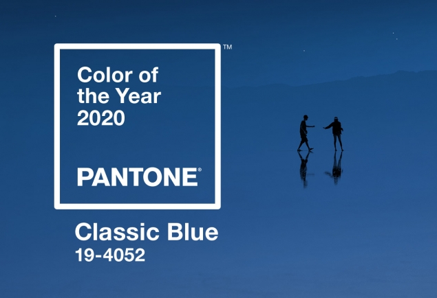
Image courtesy of Pantone

Indigo Jungle by Marianne Nix
2) Tranquil Dawn - Dulux
Chosen to reflect our desire for calm, this new colour was created by Dulux’s team of colour experts, who discuss the new trends that affect us all, then translate these insights into a paint colour trend that can be used in a variety of interiors. This particular shade will help promote wellbeing and has the unique quality of subtly shifting its tone depending on the shades that it is combined with.
“As 2020 is the start of a new decade, it’s a fresh start. New dawn. In an increasingly hectic and digital world, there is a desire for meaning and kindness. So, inspired by the colours of the morning sky, our colour experts have created an inspiring new shade, Tranquil Dawn.”

Image courtesy of Dulux
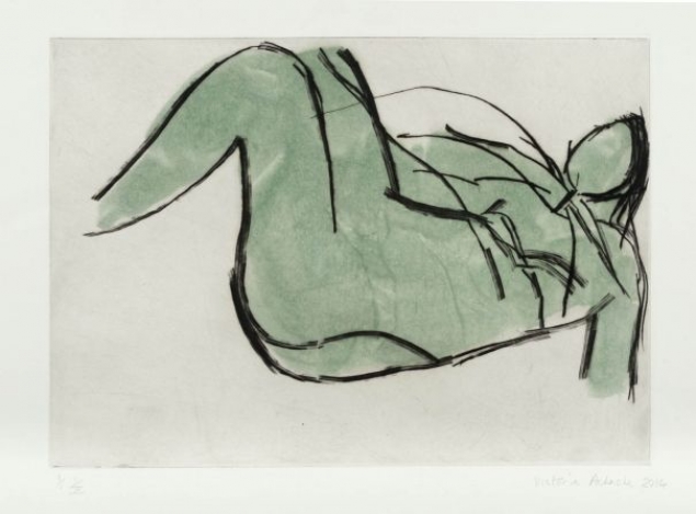
Falling Woman by Victoria Achache
3) Adeline- Graham & Brown
British wallpaper giants Graham & Green have selected a deep rich bottle green hue, Adeline, whose natural qualities work perfectly with most other colours. Their Colour Of The Year has taken its name from the first name of the famous writer Virginia Woolf, who was a main figure within the Bloomsbury group that she started with her sister. The colour pinpoints the deepest leaf green in their Bloomsbury wallpaper and amplifies it, channelling the lively country gardens and whimsical interiors favoured by the Bloomsbury Group.
Described as an 'oxygenating, fresh tone', the statement hue 'balances the ever-increasing amount of technology making its way into the home, echoing a wider interiors trend which looks to biophilic design to inspire healthier, happier homes'.

Image courtesy of Graham & Brown

Swimmer in Green by Patsy McArthur
3) Neo Mint - WGSN
Trend forecasting agency WGSN have championed Neo-Mint as their colour for 2020 and it evolves from the popularity of soft pastel shades, established by the world’s infatuation with Millennial Pink.
This hue embodies a forward-thinking mood and an almost utopian optimism necessary for this era, as we look towards the future. Events slated to take place in 2020 – including the completion of the world's tallest building in Saudi Arabia; the start of NASA's Mars 2020 Rover mission; and the introduction of Uber's flying taxis – helped the team to pinpoint neo mint as an important colour for the dawn of the next decade.
According to the trend forecaster, neo mint is a gender-neutral colour with “an oxygenating, fresh tone that aligns science and technology with nature. What is becoming clear is the importance of neo mint – a shade that succinctly aligns futuristic development with nature.”

Image courtsey of WGSN

Tiger by Ellie Vandoorne
Click here to see our collection of artworks inspired by this year’s colour trend predictions.