


 Chowwai Cheung
 Fred Ingrams
 Sophie Green
 Day Bowman
 Daisy Cook
 Halima Cassell
 Barbara Rae
 Patrick Hughes
 Bruce Mclean
 Nelson Makamo
 Sandra Blow
 Tracey Emin

It was a first, Pantone announced two colours: Rose Quartz and Serenity are the joint colours of the year for 2016, but how do you incorporate these hues into your home?
I’ll admit it, I’m a colour fan. I love the story of colour, I love the fact that it’s entwined within our history and has continued to hold symbolic significance within myriad cultures in the modern age. However, my own colour fascination aside, the hues with which we surround ourselves can influence the mood of the environment we live in; and what better way to leave behind the tumultuous 2015 than to embrace a sense of mindfulness for 2016?
Be Inspired by a Tranquil Palette
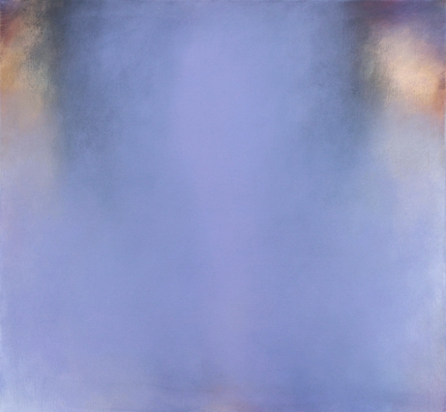
Life is busy, fast and hectic, and there are very few precious moments of calm. Thankfully, we are able to turn our homes into a haven of tranquillity through the artwork we choose! These pieces on the Rise Art website by Ruta Pangonyte, Delphine Lebourgeois and Hannah Adamaszek embrace a pastel palette, but are equally engaging for the viewer. Any of these could be hung in a room with pastel furnishings to create a light and delicate colour scheme within your room, helping to block out some of the stressful world.


Be Dreamy
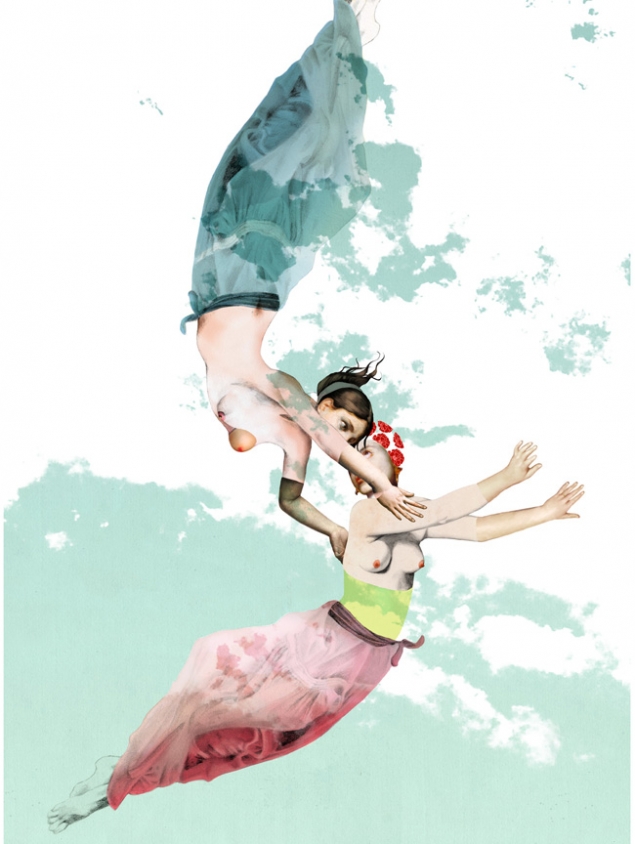
Choose works that have an imaginative and fantastical narrative. The very point of this colour palette is to reflect a sense of escapism from a hectic life, so choose artwork that is light and gent… Oh okay, fine, I just really wanted to write about Rosie Emerson! Her pieces are so dreamlike and delicate; they transport you into another world. There is the notion of getting a sneak peek into another time, or being lost in a different era and liking it. Whilst the use of colour is important, the content of the work here will also contribute to an ethereal feel in your home.

Embrace Colour
Art needn't always feature shape or figure, and sometimes simply the combination or clever use of colour is enough to create a statement in a room. These pieces from Kimberly Poppe, Tina Mammoser and Anastasia Fugger balance warm rose tones with cooler blues, and are the perfect example. Although completely different from one another in terms of artistic approach, their limited palettes and the soft merging of two colours works to create pieces with depth and tranquillity.


Accessorize
Nobody is actually advising you go out and paint your four walls a combination of Serenity and Rose Quartz... unless of course you really do want your living room to look like a shrine to a baby shower (please get in touch if you intend to do this, I may wish to hire it as a venue for my very many expectant friends). No, these delicate colours work best as small touches in a room, whether it is through art, furnishings or accessories.
If you’ve been inspired by these pastel pieces then check out the Rise Art website for many more like it!